Exploring the front pages of newspapers (10 years on)
Way back in 2012, I used the brand new Trove API to download the details of 4 million articles published on the front pages of newspapers. I did it for two reasons: first, I wanted to see how the content of front pages changed over time; and second, I wanted to show that large-scale data wrangling was entirely possible using nothing more than a laptop and a home broadband connection. I described my adventures in this blog post, but if you look at it now you’ll see lots of sad, empty boxes where live charts used to be. This is because I shared my results though a custom web application which, 10 years later, seems like a really, really dumb idea. Needless to say the app fell foul of web hosting changes and is no more. Nowadays I use GitHub and Jupyter notebooks to share my data noodling, so I thought it was time to revisit the topic of newspaper front pages, and create something a bit more robust.
If you just want the data and code, head over to the GitHub repository. I’ve shared the notebooks used to harvest, convert, and explore the data, as well as two parquet formatted datasets.
As you might expect, there are a lot more articles now, as new articles and newspapers are added to Trove every week (see the Trove Newspaper Data Dashboard for details). Instead of 4 million articles, I ended up downloading details of more than 19 million articles! I used my trusty Trove Newspaper Harvester as a library so I could more easily manage the way the data was saved. After several days I had a 14.6gb newline-delimited JSON file. I pared the data down to only the necessary fields, and used DuckDB to create two parquet files – one with the article data, and another that added up the number of words on each page in the different article categories.
One nifty thing about the Trove API is that it tells you the number of words in each newspaper article. Articles are also assigned to a series of categories, such as ‘Article’ (your standard news-type piece) and ‘Advertising’. By adding up the number of words in each category I could explore how the front page’s mix of articles and advertising changed over time. Here, for example, is what happened to the front page of the Sydney Morning Herald.
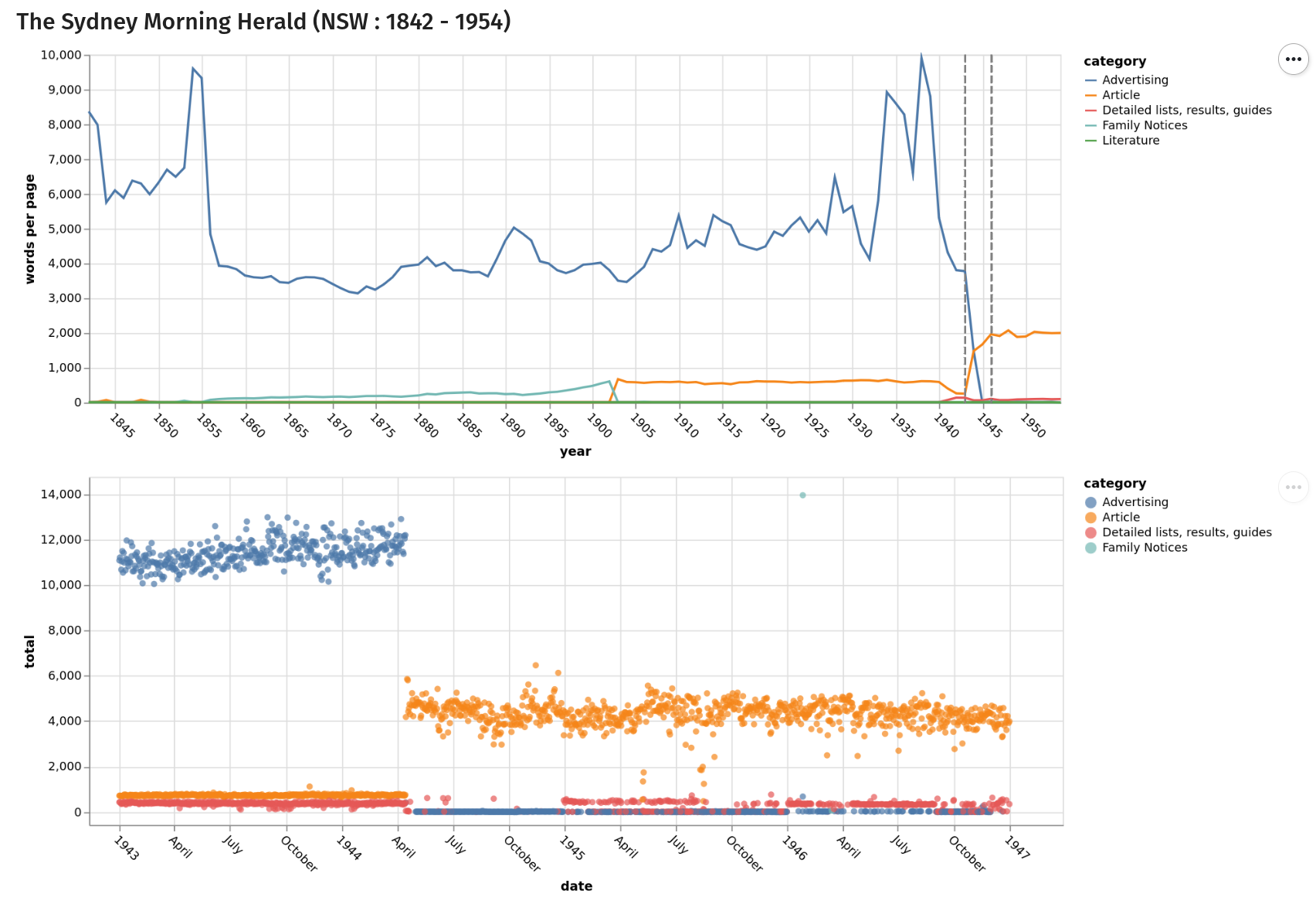
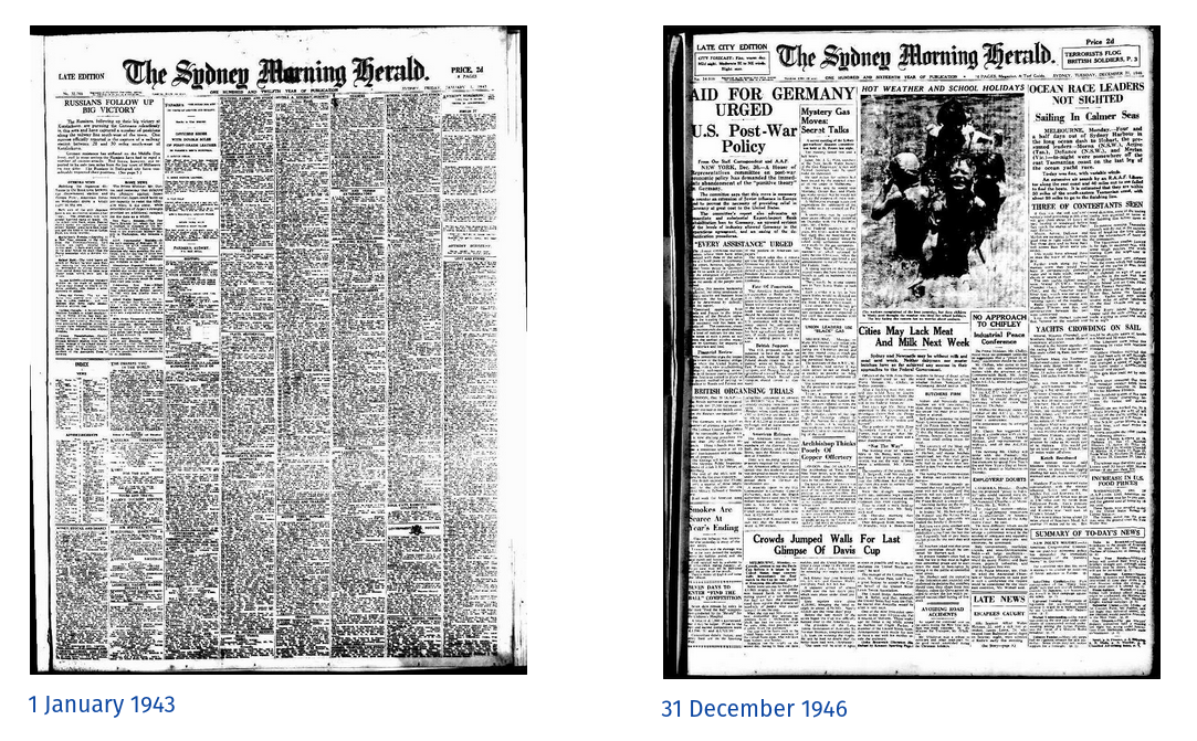
The first chart shows the average number of words per page in the ‘Article’ and ‘Advertising’ categories across the full span of the SMH’s publication run digitised in Trove (advertising is blue, and articles orange). The second focuses in on the point where the number of words in articles overtakes the number of words in advertisements. You can see that for most of the publication run, the front page was dominated by advertising. But when change came it was quite abrupt. Sydney-siders awoke on 15 April 1944 to a new look newspaper. Here’s what the front page looked like at the beginning and end of the period represented by the second chart.
Different newspapers have different histories. I’ve created a notebook that generates more of these visualisations for a range of newspapers, and tries to provide a bit more context around the changes taking place.
As I continue my work on the Trove Data Guide for the HASS Community Data Lab, I’m discovering more and more inconsistencies, oddities, and undocumented possibilities. As I was finishing up the work on front pages, I realised there was another way of exploring the same topic – by looking at the space articles take up. This data isn’t in the API, but it can be scraped from the web site. Hmmm, interesting…