Exploring georeferenced maps from the SLV collection
I’m in the process of tying up all the documentation relating to my time as Creative Technologist-in-Residence at the State Library of Victoria LAB. But as I was looking through the list of outputs, I realised I’d never written anything about the interface I created to explore georeferenced maps from the SLV collection.
I also remembered that there were a few improvements I wanted to make to the interface. So instead of spending a few hours writing up a blog post, I’ve spent several days completely overhauling the Georeferenced Maps Explorer. I’m pretty happy with how it’s working now. Have a play!
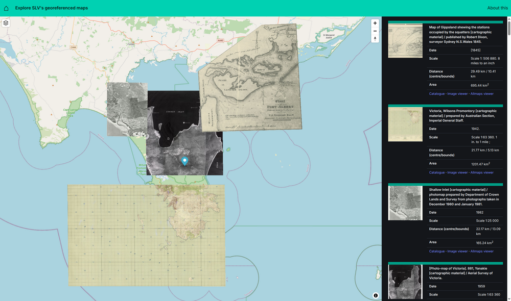
To get started, just click on the basemap. Details of all georeferenced maps within 50km of your selected point will be displayed in the right-hand column. As you move your mouse over the list of results, the boundaries of the georeferenced maps will be displayed on the basemap. This gives you a preview of their location and size. Click on one of the results to display the georeferenced map as a layer on top of the modern basemap.
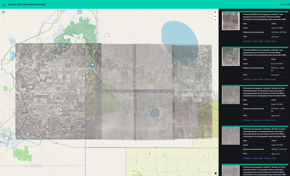
You can add as many maps as you like. If your selected maps overlap, you can change the order in which they’re shown. Click on the layers icon in the top left of the basemap. You’ll see a list of the maps that are currently displayed. Use the arrow buttons to move a map backwards or forwards. You can also use the sliders to adjust the opacity of each map. This can make it easier to examine the relationship between maps. For example, you might want to compare the features of a historic map with those of the underlying basemap.
The Explorer’s url updates with every selection you make, so you can bookmark or share a url to return to the same position and collection of maps. For example, this link will take you to the collection of maps of Wilson’s Prom shown above.
The background
If you missed the start of this journey back in November last year, you might be wondering what the georeferenced maps are and where they come from. During my SLV LAB residency, I found a way of hooking the SLV’s digitised maps up to a tool called Allmaps that helps you identify points that connect historic maps to our modern coordinate system. When enough points have been identified, the historic maps can be positioned on a modern basemap. This is known as georeferencing, georectifying, or ‘map warping’, as the results can often appear skewed or warped.
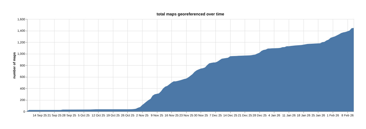
Once I had connected things up, I invited the world (or at least the tiny part of it that follows me on social media) to help turn the SLV’s maps into data. And they did! As of today, 1,447 of the SLV’s digitised maps have been georeferenced. This dashboard displays current georeferencing progress.
There’s still plenty more to do. If you’d like to help, the full instructions are available here. Georeferencing is pretty fun, so why not have a go?
You can explore the current collection of georeferenced maps in a few different ways. There’s a dataset you can download or search that gets updated every two hours. This data is loaded into a spatial database that’s used by the Georeferenced Maps Explorer. As part of my recent improvements, I’ve automated this process as well, so the database should be updated with the latest additions every 24 hours.
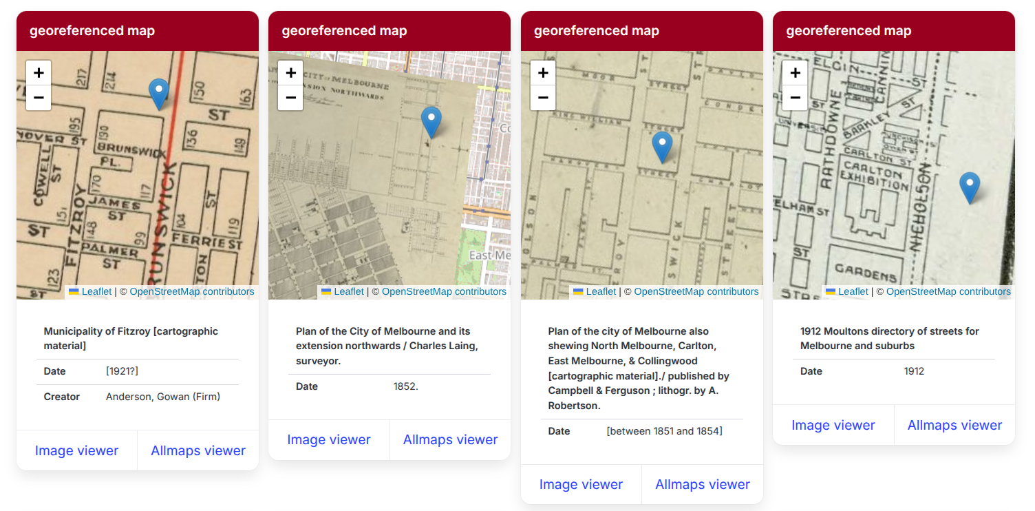
You can also search for georeferenced maps using the my place app. You just enter an address and my place pulls together data from a variety of sources – mixing the georeferenced maps up with parish maps, newspapers, photos, and entries from the Sands & MacDougall’s directories.
The interface
The Georeferenced Maps Explorer uses MapLibre and the Allmaps MapLibre plugin to display the georeferenced maps. You might notice that it looks pretty similar to the Newspapers Explorer and the CUA Browser, both of which use MapLibre, as well as Bulma for CSS. I’ve been trying to settle on a fairly standard set of tools that I can use to create and maintain these sorts of interfaces without too much fuss. Basically I just cut and paste a lot of stuff, then modify as needed.
When you click on the basemap in the Explorer, the coordinates are sent off to the spatial database to retrieve details of georeferenced maps within 50km. The spatial database runs in Datasette, which has a built-in JSON API that I use with a set of predefined ‘canned’ queries to pull back the data I need. The results are displayed in the right-hand column, along with square thumbnails generated by the SLV’s IIIF service.
The metadata includes distance and area measures. These are used to find and sort the results. There are two distance measures, one from your selected point to the closest boundary of a map, and the other to the centre of a map. If the point is contained within a map’s boundaries, then the ‘bounds’ distance is zero. The search query finds maps whose closest boundaries are within 50km. Originally I sorted the results by this distance and the area of the maps. But this meant that large scale maps that included the selected point (such as maps of the whole of Victoria) appeared above nearby local maps. To make it easier to find maps within an area, I added the ‘centre’ distance and now sort the results using that. This allows nearby maps that don’t include the current point to bubble up towards the top of the search results, above many of the large scale maps. It’s far from perfect, but I think it strikes an ok balance.
The data also includes the boundaries of each map as GeoJSON. I use this to generate a MapLibre layer that contains all the boundaries as polygons. The boundaries are hidden until you hover over the corresponding search result, then the opacity of the boundary is flipped to 1 and it magically appears.
When you click on a search result, a request is fired off to Allmaps for the full georeferencing data. The Allmaps plugin uses this to retrieve the map image from the SLV’s IIIF service and display the warped map in MapLibre.
I looked around for quite a while to find a good way of changing the opacity and order of the warped maps in MapLibre. I eventually found the Map Libre GL Layer Manager which did a lot of what I wanted. I forked the repository and modified the code to get the opacity slider to work with warped map layers. Warped map layers already have a setOpacity method, it was just a matter of checking for ‘custom’ layers, then finding where the warped map was in the layer object.
if (type == "custom") {
        layer.implementation.setOpacity(opacity);
I also made a few cosmetic changes, such as renaming the tooltips on the reorder buttons from ‘move up’ and ‘move down’ to ‘send back’ and ‘bring forward’ – up and down just confused me.
I tried for a long time to find some way of adding tooltips or popups to the warped maps that would show their details when you moved the mouse over them. I found that if you were displaying multiple maps that looked similar, such as the photomaps above, it was difficult to know which map was which. After a chat with the Allmaps developers in their IIIF Slack channel, I realised that this approach wouldn’t work as the warped map layers don’t currently listen to mouse events. Instead I decided to add hover events to the list of results, rather than the maps, and use them to display the map boundaries as described above. This way I get the connection between the map and metadata that I wanted, as well as a useful way of previewing results.
I think I’ve probably stopped fiddling with the interface for now. I hope you find it useful!
The future?
There’s more that I’d like to do with the georeferenced maps. In particular, I’ve been thinking about an interface with a slider that showed the changing patchwork of maps over time…
Related resources:
- the code for the Georeferenced Newspapers Explorer and all the other apps and sites I created during my residency is in this GitHub repository
- the code to harvest the georeferenced data from Allmaps and build the dashboard is in this GitHub repository
- there’s also the full list of all the apps, code, posts, and talks created during my residency
