Mining for meanings
In 2012, I was lucky enough to be awarded a Harold White Fellowship by the National Library of Australia. I used my time to explore ways of using Trove’s digitised newspapers as data, and presented my work at a public lecture in May 2012. I spoke from notes and never got round to writing it all up. The recording made by the NLA has disappeared from their website, but is still available in the Internet Archive. The text below is a transcription of the recording made in June 2025 with some minor editing.
You can also listen to the audio, browse the full set of slides, or download a PDF from Zenodo.
Photograph by Christopher Brothers, 2012, nla.gov.au/nla.obj-1…
I. Beyond discovery
Thanks Marie-Louise and thanks to the library for this great opportunity. And of course thanks to all of you for coming along on a night when I’m sure you’d rather be at home waiting for the budget speech. And this is the API working away here in the background. Okay, well, do I really need to introduce the newspaper database? I suspect I probably don’t for this sort of audience. You’re probably avid users of the digitized newspapers online. Are you? Yeah. I did my doctoral research back in the dark ages before Trove, and of course that meant spending many weeks, if not months, destroying my eyesight using microfilm readers. Using what are quite fragmentary printed indexes to try and find stuff which might be relevant to my study. But now of course more than 60 million newspaper articles online and most importantly, really the full text of these articles is searchable. It is something which we’re quite familiar with now, but it is something which is quite revolutionary in many ways.
This unprecedented access to a vast volume of material which documents the ordinary lives of Australians is already changing historical practice. We can now go beyond the well-known events, the big stories and explore the small stories, the fragments, the glimpses of lives which might not otherwise be recorded, but this access comes with a cost. What happens when we do a search and instead of getting 10 results or 100 results, we get 10,000 results or 100,000 results? How do we start to use or understand that sort of thing? What do we do when instead of the clarity and excitement of discovery, we end up with the anxiety and confusion that can come with overwhelming abundance?
Fortunately though, there are a growing number of digital tools which we can turn to. Tools and technologies which enable us to manage this deluge and to explore large volumes of text rather than sort of single search results. Tools that enable us to zoom out of our search results and have a look at the big picture to understand the trends and the patterns to see what’s going on. For example, perhaps we might want to try and track events over time. Have a look for example, this graph shows the prevalence of the words drought and floods in the newspaper database over time.
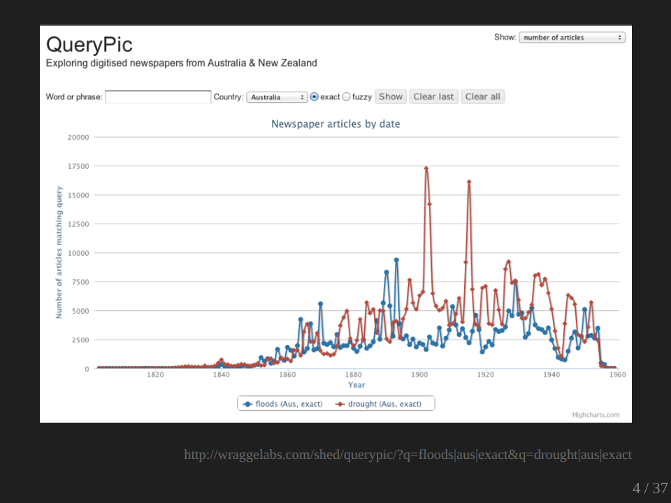
So we can actually look at that and use it as a way where we can map it to the specific events. And we can see here, of course, this is the federation drought at this point. We could also start to look for patterns that aren’t easy to see within your sort of normal list of search results.
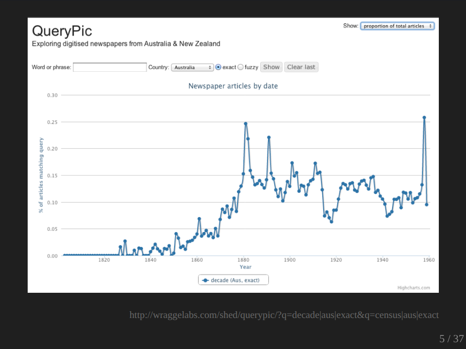
I was interested in having a look at how the word decade might be used. So I searched for decade and I found, as you can see, that there’s these nice sort of regular peaks and I was wondering why have we got these such these regular peaks? And I did a bit more digging and I discovered why. That red line shows the usage of the word census. And you see here how the little peaks sit on top of each other?
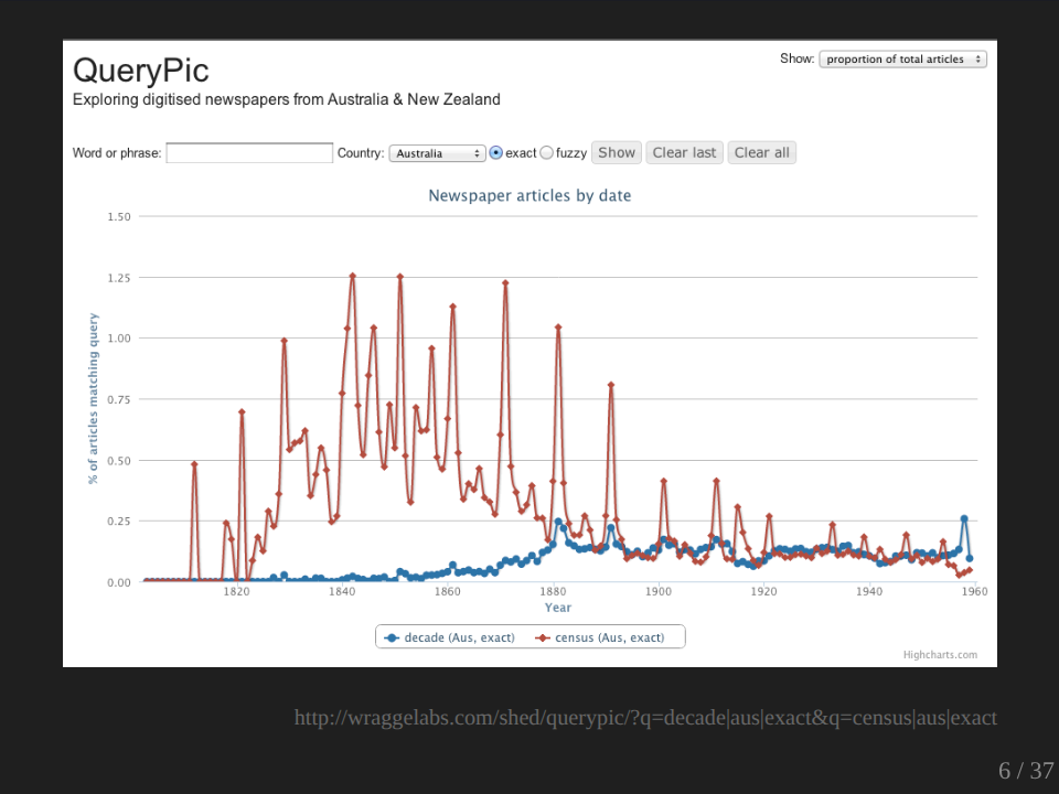
So obviously the time we talk most about decades is when a census has come out. So again, this is a sort of pattern which would be very hard to find other ways by just sort of working through our list of search results. We can also use these sorts of technologies for exploring changes in language, the way we talk about things, the labels we use.
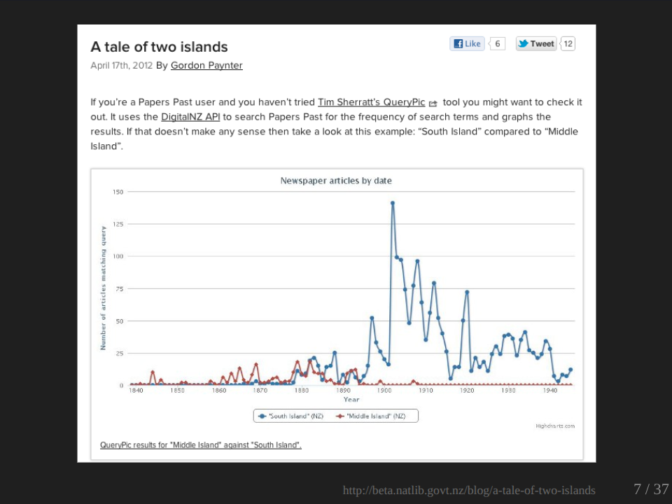
This is an example which I’ve taken from the National Library of New Zealand searching through New Zealand newspapers in this case. But what they’ve done is to look at the change in usage of the name for the south island, which was apparently, I didn’t know this originally called Middle Island and changed to the South Island. And so you can see here this sort of process of transition happening before South Island takes over completely.
We can also challenge our expectations. Now, I was always of the belief that the traditional name for people from English cultural background of that chap who wears a red suit and comes around at Christmas time was Father Christmas. And then in recent years that has been supplanted by the sort of Americanized Santa Claus, but it seems I’m wrong.
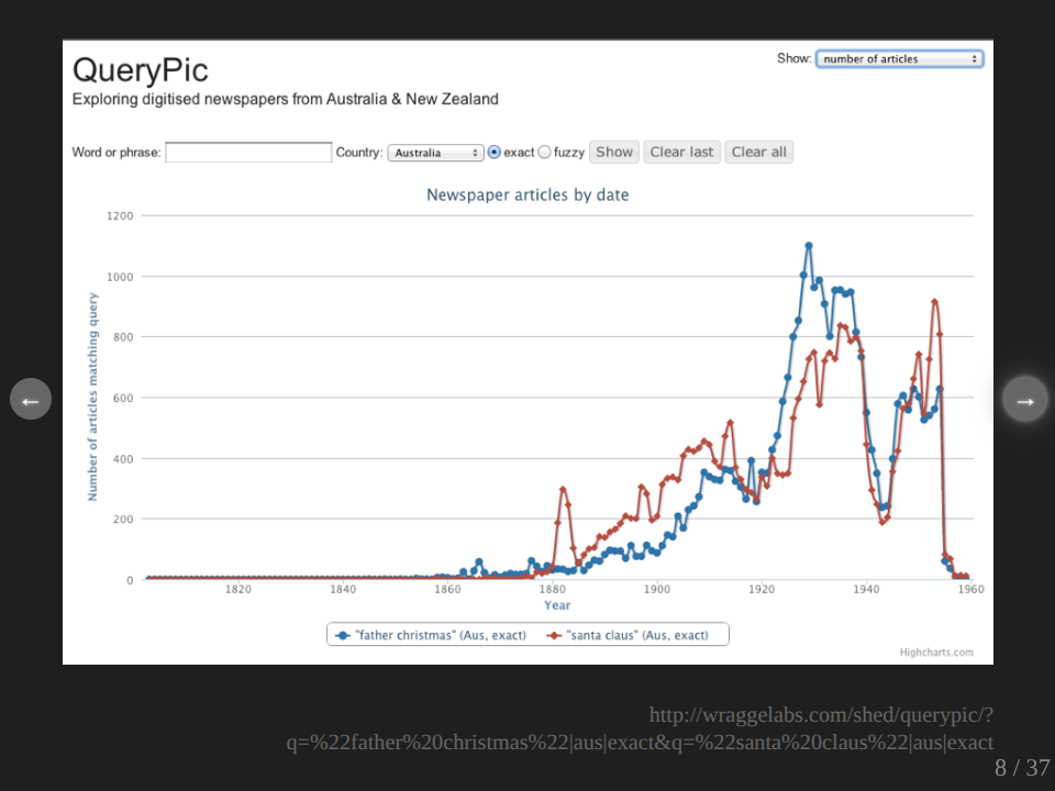
The red line here is Santa Claus, the blue line is Father Christmas. And so if we look here from the late 19th century to the early 20th century, Santa Claus is definitely winning. What’s interesting though, really interesting, is when we get the change over. Any guesses as to what’s going on there?
Audience: Coke advertising.
Pardon?
Audience: Coca-Cola advertising.
Well actually, I don’t know. My hypothesis, what’s happening, is this is around sort of 1914 and it seems that over the war period, Father Christmas starts to win over the top of Santa Claus. So whether, I mean this is pure hypothesis at this point, and it’s something which would be interesting to explore, whether it’s the Germanic sound of Santa Claus, it sort of lapses in popularity or perhaps there are other causes, completely other circumstances. But that’s the value of these sorts of things that they do allow you to ask some questions and to prompt you to do some other sorts of investigation.
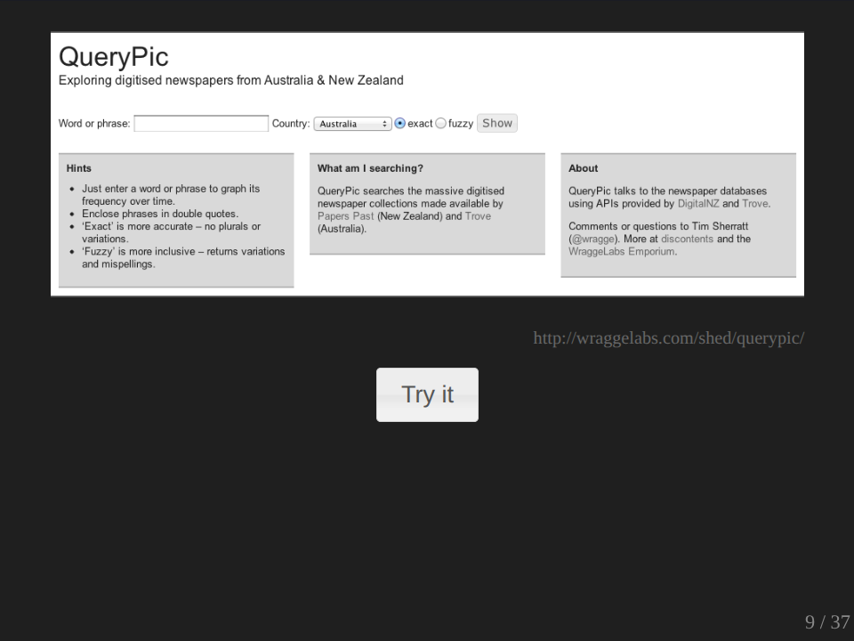
Now these graphs which I’m showing you, were all created by a tool I developed called QueryPic. And we won’t just show you the slide, we’ll actually use it. I want a word. Anybody give a word?
Audience: Brooch.
Broach?
Audience: Because yours is nice.
I’m not sure it’s going to show anything. Yeah, brooch.
Audience: Know what we’ve done ‘automaton’, the one we talked about last week.
You have to spell it for me.
Audience: A-U-T-O-M-A-T-O-M. Actually, correct. That’s what you…
No, no, no, this is right. Okay. So what this is doing now, it’s actually going off to the Trove API and it’s getting the total results. I mean it’s actually a very simple tool. All it’s doing is it’s taking your query and it’s searching for each year across the span of the newspaper database, and it’s getting the total number of results for each year and it’s then presenting them in the form of the graph. As I say, it’s very simple, but it’s also quite effective as you can see. And it’s useful and it’s also quite fun. And what it gives you is the ability to quickly explore a hunch, to get a sort of sense of context or to start exploring, to start framing a more specific research question without spending… there we go… without spending days searching or tabulating as you would normally have to do. So you can see how easy it is to use and if you want to actually compare that to something else, you can just type in another word.
Okay, now there are obvious limitations to a tool like this. There’s a lot to unpack. I wouldn’t want to say that it’s evidence because there is so many assumptions built into the back end of it. Questions about what the search engine is actually giving you back, different usages of terms, obviously the contexts and things like the quality of the OCR itself. You know there are a whole lot of stuff. But despite all that, I think it is quite useful, as I said, in terms of allowing you to explore things quite quickly and to follow your hunches. I regard it as a starting point, not as an end.
Now, but there are some folks… let me see if it’s going to finish.. there are some folks who are a bit more confident about techniques such as this and who would suggest that not only can they provide evidence, but they can actually be used to develop mathematical representations of past behavior.
II. Finding formulas
You may have heard of the Culturomics project from Harvard University. These guys got access to the full corpus of Google’s digitized books. So 5 million books, the text of 5 million books. They pulled it all apart. They did a bit of cleaning up of the metadata, all sorts of stuff, and then they started searching it and they started to see what they, but they could pull out of it. And when they started searching, they noticed all sorts of patterns appearing and they argued that these patterns could actually form the basis for what they said was a new science of culture, hence culturomics.
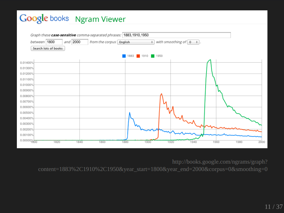
There’s a lot I might say about that, but I just want to look at one example. Okay, this is an example which in their published paper in Science, they called ‘We forget’, and I generated it using an online tool called the Ngram Viewer. You can go and do this yourself if you like. And what it’s showing as you might be able to see is it’s searching for years used within the text. So 1883, 1910, 1950. It’s pulling out all the instances where those labels are used within the text, where those terms are used. And there does obviously seem to be some sort of pattern. And the research has noticed that the graphs have a characteristic shape, obviously rapid ascent and then a decline. But they also notice changes. Of course, the size of the peaks is changing over time, getting higher. They say that this is indicating a greater focus on the present and the rate of decay is increasing, so that the peak is actually dropping away faster. And they say from this, we are forgetting our past faster with each passing year.
I thought it would be interesting to repeat this experiment using QueryPic. So I did. It looks a bit different.
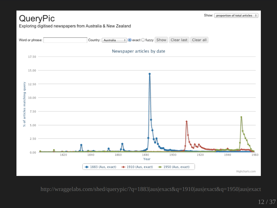
I mean, before we could interpret this difference, of course, there’s a lot that we would want to ask, a lot of, first of all, methodological questions. Again, exactly what are we searching in the two instances and how can we compare the searching, the books in one instance to the newspapers in others - dates obviously play a different role in newspapers than they do in books. But it was actually the conceptual issues, which really struck me in relation to this example and in particular the assumption that we can compare the past, present, and future uses of these labels as if we are talking about the same thing: as if the label 1950 means the same thing before 1950, in 1950 and after 1950. The names for events and periods that we assign, that we share, that we use are themselves the products of historical processes. They slip, they shift, they change.
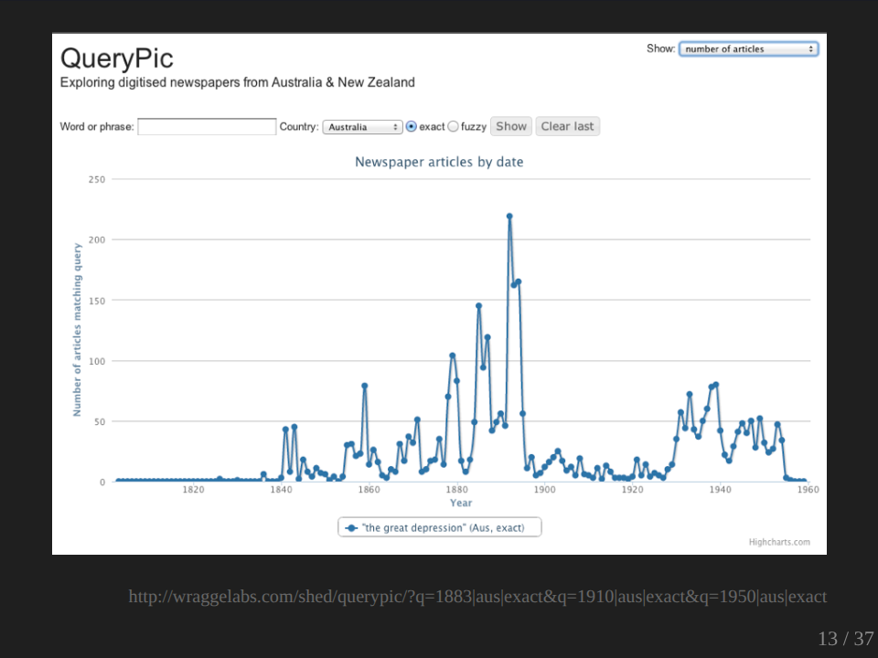
We all know what we mean by the Great Depression. Where’s the Great Depression on this graph? So in terms of the usage at the time, the usage of the term ‘Great Depression’ was actually greater in the 1890s than in the 1930s.
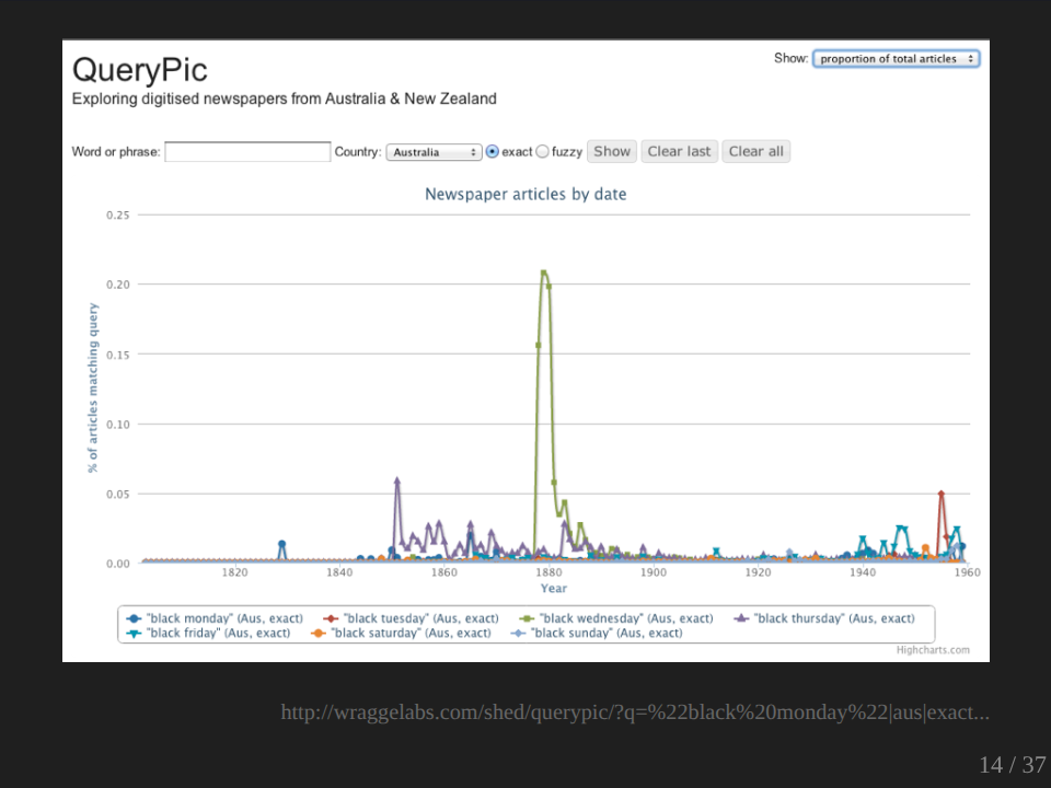
We’re very familiar with the usage of the, we’re talking about ‘black’ days like Black Tuesdays. Black Fridays of course, is the one we’re most familiar with. And in Australia, these labels are generally attached to bushfires of course, and that’s the context where we generally understand them and use them and remember them. And over here, of course we have Black Friday. So what’s this big peak here? It’s not a bushfire. It refers to the Victorian government’s mass sackings of senior civil servants and judges in 1878. Obviously it was an extremely important event at the time, an extremely important event in government in Victoria, but it doesn’t quite figure in our collective memory in the same way as Black Friday does.
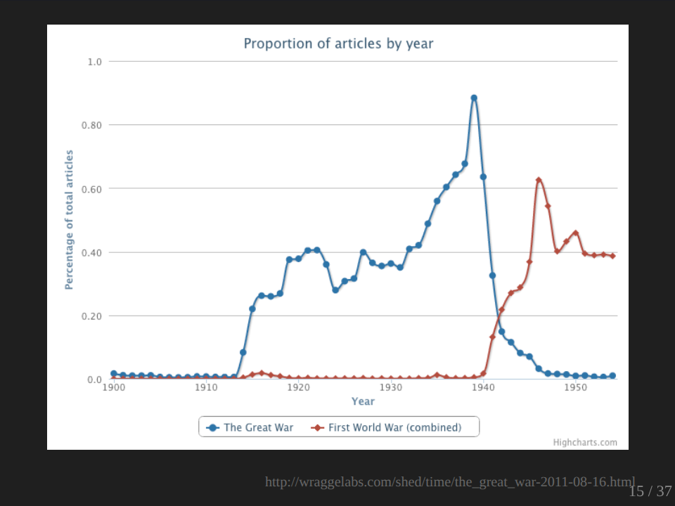
One of my early experiments with QueryPic was to look at the question of when did the Great War become the First World War? At what point did we stop thinking about the Great War as the war to end all wars and realize that it was one in a series of global conflicts? And the graph really does a nice job of confirming our expectations, I suppose, in that we see a nice crossover late in 1941, which if we were thinking about the passage of the war would be about when we probably would expect. But what’s missing from this, what’s missing of course is just the war.
Just as with the Great Depression and with the Black Wednesday, what’s hard is trying to recapture the moment as it was happening, the sense for want of a better word, of present-ness. Now, if we go back to ‘We forget’ what are we doing when we’re talking about one of these dates? I mean, if we think of the present as providing a line there - past, present, future - on the past side, what are we doing? We’re anticipating. We’re predicting. Perhaps, we’re dreading. And present, we’re experiencing, we’re enjoying, maybe suffering. In the future, we are remembering, we are regretting, perhaps reflecting. So instead of lumping all these together, it seems to me that we should be teasing them out and exploring their different interconnections.
We should be trying to give the past back its own sense of the present. And this in essence was the modest and thoroughly achievable goal of my Harold White Fellowship. I wanted to explore the possibilities of the digitized newspaper collection in supporting this sort of rich temporal contextualization using digital methods to recover the pasts, the presents and the futures of any moment in our history. I have to admit, I haven’t got very far yet, and Marie-Louise has been doing a good job of reassuring me that sometimes the fruits of these things take a while to develop. Now, there are a number of reasons why I haven’t gotten as far as I wanted, but I do have a few sort of sketches that I want to share with you.
III. The future of the past
Okay. What I decided to do is to try and create a sort of manageable sample set. So I decided to work with articles, which included the phrase, ‘the future’, in the heading or the first four lines of the newspaper articles, and that’s one of the facets you can use within Trove. Why did I limit it in this way? Well, I’ve been doing a lot of different work in Trove as Marie-Louise said. One project I’ve been working on was looking at ways of finding editorials within Trove and exploring the content of editorials over time. And in doing that, I discovered a number of frustrating things, one of which is sometimes the articles aren’t divided up as nicely as we want them to be. Particularly with editorials, editorials on different subjects are often joined together, so it’s difficult to separate out the specific ones that you want, but I thought by limiting my search in this way, that it increases my chance of relevance. And it also brought the number of matches down to what I thought was a reasonably manageable 60,000 or so.
So I started harvesting those 60,000 articles. I have over time been developing a number of tools working with Trove. One of which is a harvester, which enables you to get the data in bulk. And of course that’s necessary if you’re going to do this sort of large-scale analysis on it. I modified my existing harvesting tools to save the results directly into the database and when the API became available, I modified it to use the API, which makes a lot of things easier. Now, after about 40,000, I thought I probably had enough, and I decided I’d trust in Trove’s relevance ranking and just work with that set.
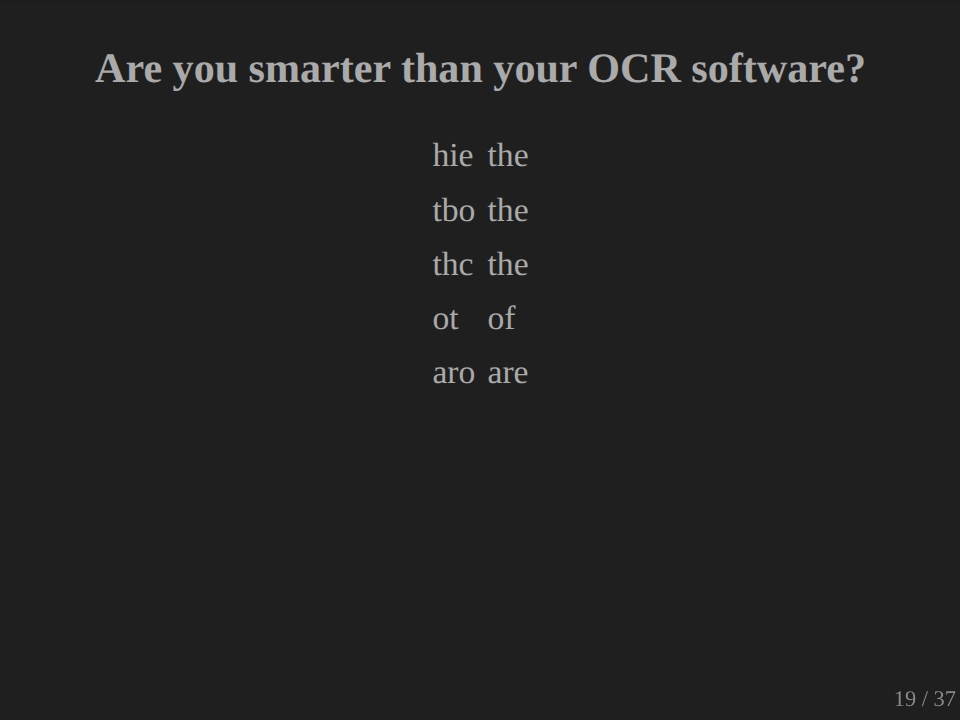
And then it was time to do some cleaning. Now, Trove’s crowdsourced OCR correction project has been a wonderful success, of course, but it’s worth noting that with the sample of articles that I harvested for this project, only 2% had any corrections at all. So 98% totally uncorrected, totally untouched. While I couldn’t hope to correct all of those articles myself, I could at least try to reduce some of the noise, which is created by these sorts of OCR errors. So I developed a series of scripts which would try to clean up some of that OCR output. First of all, it corrected some errors which are fairly consistent and hopefully fairly unambiguous OCR errors. And you can test yourself here. What’s that meant to be?
Audience: His.
Pardon?
Audience: His.
Nope. The.
What about this one? Nah, the. This one? No, of. Should get that one. Ah, yep. And you can check. There we go. Look of, ah, yep. So there are a series of these which I could through a script just fix up. I then checked each word in the text against a series of dictionaries and word lists, and this included a word list of places which I actually extracted from the places Gazetteer provided by Geoscience Australia. Anything which didn’t seem to match up, I marked up in a way that I could extract it later if I wanted to. And all of this, you’ve got to understand, went through a lot of trial and error, just trying stuff out, seeing what it produced, trying it again, fiddling with it lots and lots and lots of trial and error.
But after that, I could do some fun things. You’re all of course familiar with word clouds, but I bet you haven’t seen a non-word cloud. This is my non-word cloud.
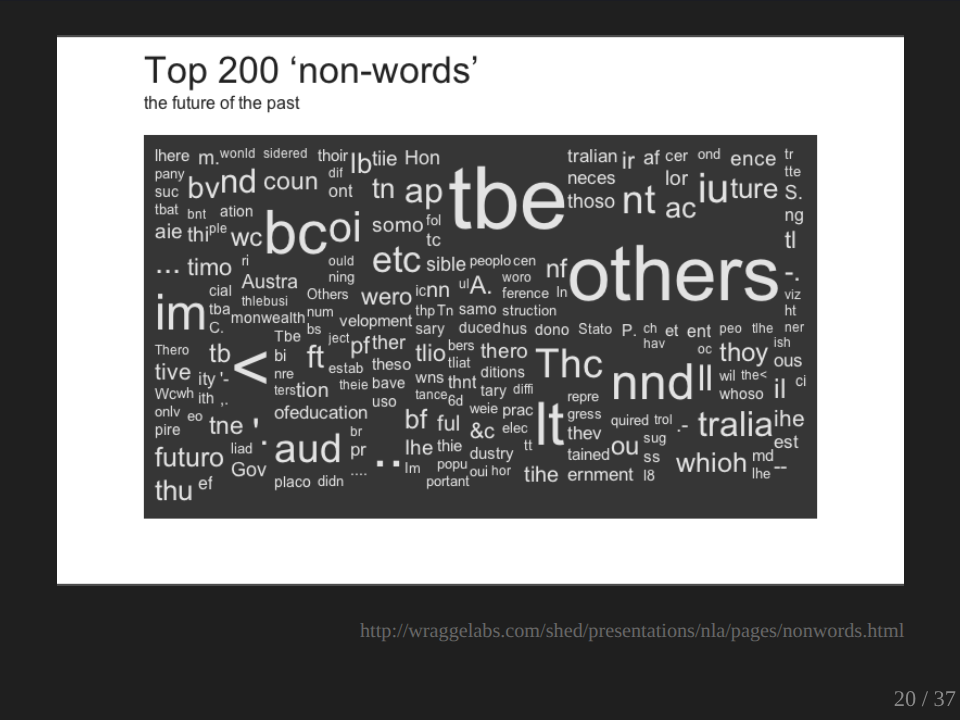
Now, of course, the big question is what is ‘others’ doing there? I don’t know. For some reason my word list didn’t like the word others, but of course you can see here some more sort of consistent OCR errors. There’s another ‘the’ and another ‘the’, and that would be a ‘be’, in most cases. And we also see where words have been split up. We’ve got a ‘tralia’ down there. Oh, that’s a ‘which’ obviously. So it’s actually quite useful visualizing in this way because I can then feed that back into my process of cleaning. I can see where the common errors are, and I can start to feed that back into the process.
For each article that I processed in this way, I generated an accuracy score, which was simply the number of recognized words divided by the total number of words within the article. And I could use these scores to develop a couple of overviews.
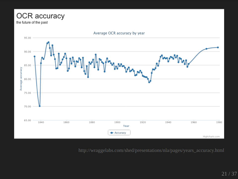
So of my set, this is only just my sample of course, so this is OCR accuracy over time. There aren’t many articles in this earlier period, so it’s probably not worth worrying about too much. But what’s interesting is this decline here down to the 1920s where we’re going below the 80% mark. Why is that? I’ve got no idea. There are a whole lot of variables which could be certainly involved here, whether it’s the fonts, whether it’s the quality of the printing, the quality of the paper, the quality of the microfilming. I don’t know. It’s something which would be interesting to explore further and to and investigate.
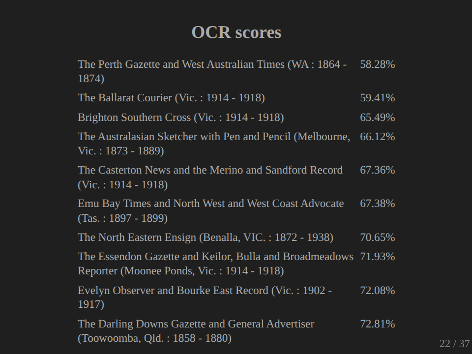
We can also have a look at the poorest performing newspapers. So the Perth Gazette and West Australian Times didn’t do too well, and it got 58% in my scorecard. Again, this is only a select sample, so I’m not quite sure what you can read into any of this, but it’s sort of interesting. These figures weren’t particularly important for my work, but I do think that the general issue of OCR quality is really vitally important, particularly as we make more and more scholarly use of these sorts of collections in bulk. I mean, obviously we need to improve the quality, but we also need to expose our assumptions about the OCR quality that underlie our work so that when we are putting forward something, some sort of analysis of the text, we’ve got a way of communicating the quality of the material that we’re working with.
I then decided to make my sample set even more manageable by selecting just the first 10,000 articles, which had accuracy figures of over 80%. So I used my scores and I went through and I decided just to choose those ones which seemed to go pretty well. Of course, as any good digital humanities person does, I then started counting words.
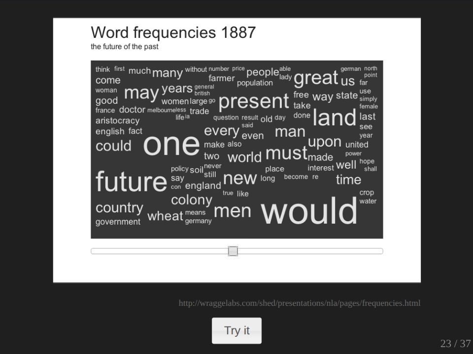
As with most of this stuff that I’m showing you tonight, it’s online and you can go and play with it and use it yourself. So this shows the word frequencies over time, and there’s a time slider here, and you can just drag it along and see what’s happening in different years. Now, nothing really significant jumps out at me from looking at the word frequency clouds here. I mean, what is sort of interesting I suppose, is the preponderance of ‘would’ and ‘could’, which I suppose confirms the future orientation of the sample set that I’m working with. And there may well be other things within there that jump out at you. And so as I say, jump online and have a look and have a play with this and see what you can make of it.
I mean, word frequencies… Okay. So word frequencies can be interesting in getting a sort of overall picture of a large amount of text and starting to track some changes over time. But this sort of word frequency tells you what’s common. It doesn’t tell you what’s distinctive. It doesn’t tell you what’s interesting in an article. And another measure we can use to try and get at the distinctiveness of a piece of text is something called TF-IDF. It’s an acronym, term frequency, inverse document frequency. And what it does, it looks not just at the frequency of a word within a particular piece of text, it also looks at the frequency of that term across a collection of texts. So a word that is common in a particular article, but not very common in a collection of articles will appear as more significant, more heavily weighted in its TF-IDF value.
You use TF-IDF values all the time. They’re used by search engines in calculations of similarity. They can take the TF-IDF values, convert it into a sort of mathematical format and use it to calculate the similarity between two pieces of text. And the results of calculating TF-IDF values for collections like this are pretty interesting, and I’ll just show you a little comparison.
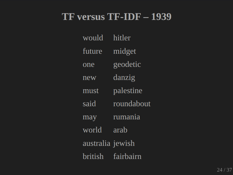
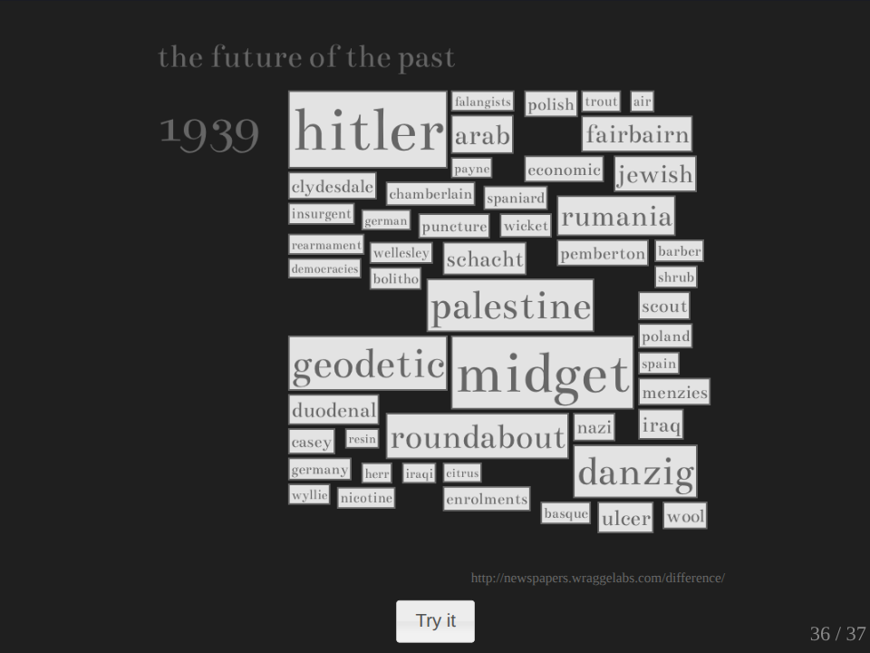
So on the left-hand side here, we have, this is 1939. The top 10 words on the left-hand side are just the plain frequency values, and here are the TF-IDF values. So you see we’re getting at something quite different and something quite interesting here. Obviously 1939, Hitler doesn’t figure in this list of terms. He’s at the top in this one. But we also get these really odd things like midget and roundabout. I found it really interesting producing these values, and I found them quite sort of evocative and interesting and wanted encouraging me to explore more, and I’m going to talk some more about this a bit later.
But I finally just wanted to show you one other way of understanding a collection of texts, and that’s through a thing called topic modeling. There’s a lot of topic modeling going on in the digital humanities at the moment, and there are a number of good blog posts, which I’ll put links to from here, which tell you about what topic modeling is. I’m just going to quickly race through it. Basically, I use a piece of software called Mallet. I pointed Mallet at my collection of texts, told that I wanted to define 10 topics, that is 10 clusters of articles within those texts, and it just did it.
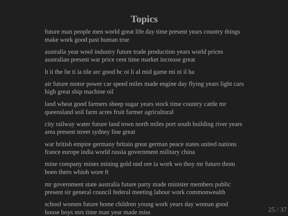
And what it came back with is these lists of words which are grouped according to the topics which it believes existed. You can then go through and look at these lists of words and start to interpret them to try and understand what those topics are. And most of them are pretty clear. This of course, is the topic that tells me that I still didn’t clean up the OCR enough, but it’s interesting that it brought them all together.
We’ve got, I mean here we’ve got trade, here we’ve got technology, here we’ve got land/rural, here we’ve got international relations, here we’ve got government, and here we’ve got home and society. And it’s amazing once you run these things, how much sense the topics actually make to you.
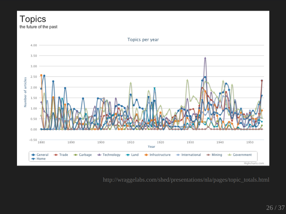
And it also goes through and for each article in your collection, it weights them according to these topics. So you can then go and for each article you can see which is the most heavily weighted topic for that article, and you can calculate the number associated with each topic and you can do something like that. Okay, that’s not terribly instructive as it is, but you can, I won’t show you now, but if you click on that and go to the live version and you click on the legend down the bottom there, you can actually take away some of the lines so you can actually see what’s happening underneath, so you can just see the lines that you’re interested in.
But basically, I want to do a lot more work on these topics at this stage, and I haven’t really done a lot of interpretation of them. I want to see how I’m actually using those weightings and find better ways of actually looking at them. So anyway, here I am. Not a lot of interpretation at this stage. No great insights. I have some data. I have a data set, and I’m going to be continuing to play with it. And as I’ve said, all this stuff is available online, so you’re welcome to come and play with it too and see what you can make of it. Now, you may think that I’ve gone into a lot of tedious detail about what I did. Well, I’ve actually saved you from a lot of the gory details.
IV. Meanings for mining
The truth of much research in the digital humanities is that large amounts of time are spent yak shaving, and data munging. If you don’t know the term ‘yak shaving’, it’s that process that we’re all familiar with, when you start doing a particular task and you realize, in order to achieve that task, you have to actually do something else or research something else, and that actually continues into infinite regression until you find yourself doing something which seems totally unrelated to the task that you started with. I’ve had a lot of that recently. There were lots of issues just involved in using this data and starting to manipulate it. As I’ve said before, the issue of the OCR quality is crucial, and we have to be upfront about the problems and continue to look for the most effective solutions. We have to talk about questions of selection and completeness. What’s actually in Trove? How does it change and how does this sort of influence the results that we get?
One of my examples here is a thing called the Atomic Age Exhibition, which toured around Australia in 1948-49. It was a big thing. Many, many thousands of people visited. It was at the Easter Show in Sydney. If you search in Trove for Atomic Age Exhibition, you’ll find quite a lot of results coming from the Courier Mail in Brisbane. You’ll find virtually nothing from Sydney and Melbourne, and you might be inclined to think that the exhibition didn’t actually go to Sydney and Melbourne. Why is there nothing in Sydney and Melbourne? Because the exhibition was sponsored by the Herald in Melbourne and by the Daily Telegraph in Sydney, and both of those titles are currently not in the newspaper database.
So we’ve got to bring these sorts of questions and perspectives as we start to do this research. Another barrier, which I started to butt my head up against in doing this was that of computing power. Generating the TF-IDF values for my sample took about a day and a half on my laptop. And of course, then you realize, you did something stupid and you have to do the whole thing again. And I did wonder at various times whether I was reaching the limits of what’s practically possible for one bloke and his laptop and wondering whether my sort of piecemeal efforts will be blown away by academic teams with access to research funds, bright young graduate students, and time on a supercomputer.
Now, this list of problems and concerns might seem a bit depressing, and it might not be what you expected from this talk, but I want to reassure you, there are digital tools that make it easy to get started and start exploring the possibilities. QueryPic of course, there are other things like Voyant, which is a great online tool for starting to do text analysis, but sooner or later you’re going to have to confront some pretty hefty questions. But hey, that’s just history. The past is messy and it raises difficult questions about things like selection and interpretation. The issues aren’t necessarily new, it’s just that they’re raised in a bigger, more technically challenging context.
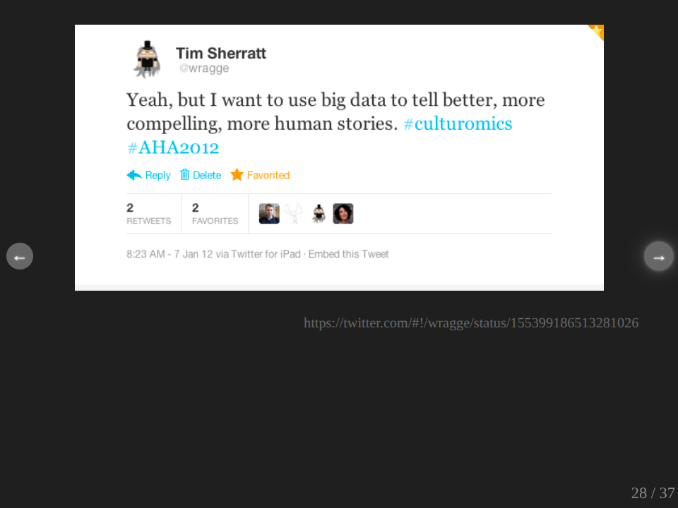
But what does really bug me is a nagging feeling that I should be taking statistics more seriously. That in constructing the sort of examples which I’ve been showing and the tools that I’ve been demonstrating, that I should actually be less impressionistic and more rigorous, as if I’m sort of not doing justice to the vast computing power that I have at my disposal. But I don’t want to do that. In January, I was at the American Historical Association meeting and I was actually able to see the culturomics guys live in person doing their spiel. And as they described their vision for a new science based on access to these huge cultural data sets, I tweeted, “Yeah, I want to use big data to tell better, more compelling, more human stories.”
The British historian Tim Hitchcock has similarly described his own unease that the demands of big data seem to be moving him towards a more positivist style of history. In the humanities, we’ve been really fortunate to make use of many decades of research into things like information retrieval. We’ve adopted many of their concepts, their tools, and their formulae, but we’ve also adopted some of their language. And so we talk about what we’re doing as mining. Mining is an extractive process. We dig stuff up, we pull it out of the ground. But this seems to be pretty much the opposite of what I want to do. I mean, I do want to find structures and separate them out for different types of analysis, but then again, I want to put them back together. I want to observe them in different contexts as rich and as complex as possible. How do we do that?
Well, first of all, we have to work out better ways of incorporating these sorts of big data perspectives into the narratives that we write. Just as QueryPic gives you that opportunity to sort of zoom out and get a big picture, I think we have to take control of the zoom and use it to our advantage. And this, by the way, probably means developing new forms of publication that allow easier and better integration of data and text. It’s challenging, but there’s not much point to dwelling on the dangers and problems of big data, and as Tim Hitchcock concludes, we simply need to get on with it.
V. Screwmeneutics and deformance
The second approach is to foster acts of creative subversion, to use digital tools in new ways. Literary scholars within the digital humanities talk about the possibilities of deformance, of using computational methods to change texts in ways that can open them up to new and new critical perspectives. Stephen Ramsey also talks about moving beyond traditional forms of search and browse and admitting ‘screwing around’ as a legitimate research methodology. Of course, historians don’t want to start deforming their sources or do they?
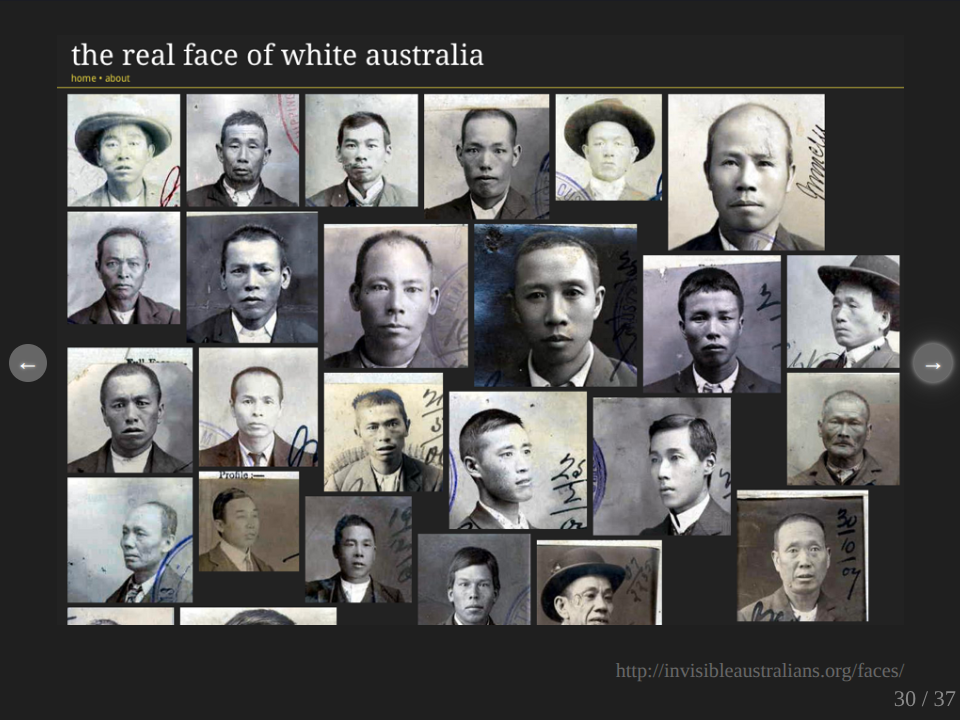
This is an experiment I created called The Real Face of White Australia. I always get a bit teary when I put this up. Well, what I’ve done here is actually use computer vision software to extract portrait photographs from certificates, which were used in the administration of the White Australia policy. These are records held by the National Archives of Australia. There’s several thousands of these, and this is just from one series, and you can just keep scrolling and scrolling forever, or almost forever. So by manipulating the sources in these ways, by extracting those photographs, I’ve created a new way of seeing these records and it’s quite powerful.
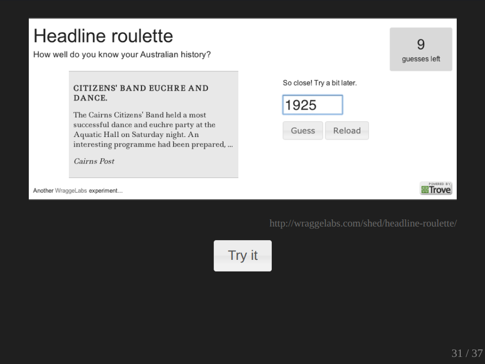
But we can also be playful. You may have seen this. This is a little game that I created using the newspaper database. Again, it’s very simple. It just picks a newspaper article at random from the database and asks you to try and guess the year in which it was published. So any guesses for this one? What would we say? Let’s say 1850… That’s a bit later than that… Let’s see, it’s earlier. Okay, so you can keep going like this. You can go and try it out yourself later. As I said, it’s very simple, but it’s also strangely addictive. And of course, it’s also a way of exploring the content of Trove by screwing around.
QueryPic, the Real Face of White Australia and newspaper roulette, my Headline Roulette, also have something else in common. They are public. I want people to use them. I want people to have fun. I want people to be moved. I want people to find things to be surprised and to do history.
Just yesterday I received an email from a self-confessed Australian history addict, oh no, Australian history fanatic, sorry. And she had become addicted to Headline Roulette. She wanted to know if I could add a facility for users to actually save their scores. So presumably they could go back and see if they’d improved or share them with their friends. So obviously the next step is the Facebook application. I mean, other people have described to me how scrolling through the Real Face of White Australia brought them to tears. And I’ve come to realize that these sorts of interactions really mean more to me than a footnote in an academic article. I’ve probably just killed my hopes of an academic career there. I want to use digital tools, I do want to use them to deform history. I want to use it to deform history in a way that makes it accessible to new audiences in new ways. And so I present to you in honor of my Howard White Fellowship, a new experiment.
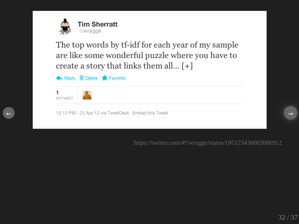
Now, I described to you before the process involved in calculating the TF-IDF values. What I didn’t describe was the fun that I had when I was doing it. It was really quite exciting and amusing and funny and all sorts of things, watching the words fly past on the screen. And as I completed each year, I would had a little script which would show me the top 20 words for that year. And anybody who follows me on Twitter, we all have a good picture of what was going on there because I couldn’t help but share this. So I mean, it tells their own story. I mean, it was really like a sort of wonderful puzzle as I say there, as they all came up. And then I started tweeting some of them.
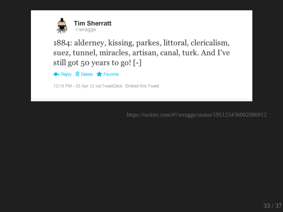
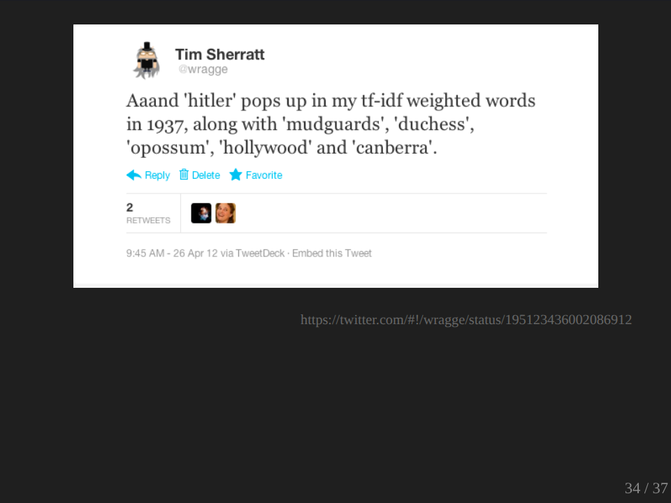
This was a nice one. I like the ‘hitler’ with ‘mudguards’, ‘duchess’, ‘opossum’, ‘hollywood’ and ‘canberra’.
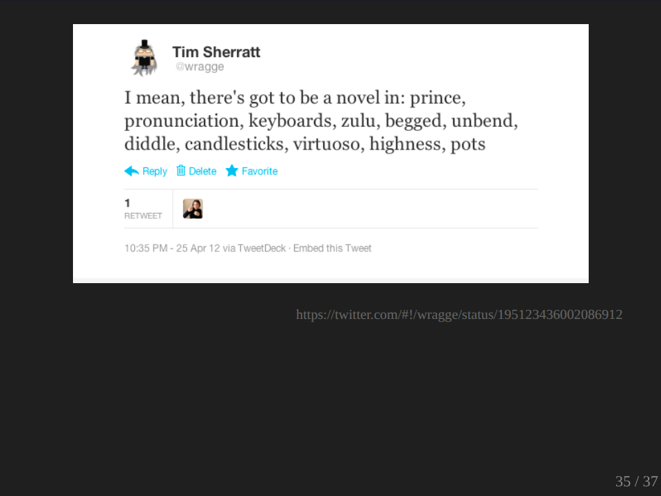
And as I said here, of course, I mean there’s got to be a novel in ‘prince’, ‘pronunciation’, ‘keyboard’, ‘zulu’, ‘begged’, ‘unbent’, ‘diddle’, ‘candlesticks’, ‘virtuoso’, ‘highness’ and ‘pots’. This started me thinking, was there a way I could share this experience and use the TF-IDF values as a way of exploring my data set, a way of opening this experience to others, as creating a sort of shifting playful window on the future of the past. So this is my first attempt. Again, public, go play with it.
I’ve actually deliberately tried to keep most of the metadata away from this interface because I wanted the words to be the focus. And yeah, it does look a bit like that fridge poetry thing that you can get, and that’s quite deliberate. I mean, actually at some stage, I want to add a box down here where you can drag your words down here and make your own sort of collections and tweet them. What it’s showing you there is just a random selection of TF-IDF values from my sample, and you can click on any one of these, and it goes away and it sees, first of all, how many years have that value attached to it. If there’s only one year, then it’ll actually return that year. If there is, let’s see if we can find one that has more than one year. If it appears in more than one year, then it pulls out a random selection of those values from those years.
Okay. Oh no, we’ve got 1943. I’m not doing a good job of it this time. Anyway, you can have fun with it. And of course, if you want to actually see what’s going on, you can click on these and it will actually load the articles here, and you can explore the text of them there and see where the word’s popping up.
Okay, what is this? I’m not quite sure. It’s not really a discovery interface, although you can find interesting stuff. It’s not quite a game, but it is quite fun to explore. To me, I really, I’m sort of in love with it at the moment because it actually, I mean, you think about what I’m trying to do in terms of recapture the presentness of the past. Our experience is not about just the big stories of the day. Our experience of any moment includes a whole lot of trivial aspects. And I love the way that this sort of brings together Churchill and Corpuscle and Melvin, whoever Melvin is. I love the mix of words, and it just, to me is incredibly evocative. It makes you want to start imagining stories. It makes you want to explore, it makes you want to find out more, but it just has a wonderful, exciting aspect to it itself. So I’m not quite sure what I’m going to do with it or how I’m going to develop it, but really, as I say, I’m quite in love with it at the moment, and I hope you’ll have a play with it and see what you make of it.
Could it be a discovery interface? I don’t know. It does enable you to get into my dataset, but of course, it’s obviously from a rather indirect means and it includes lots of randomness as well. And I’m a big fan of randomness in actually developing new ways of discovery. So there you go. Please take it away, enjoy, play. I may not have conquered the meaning of time yet, but experiments like this actually make me think about the form in which I actually present those sorts of arguments and those sorts of ideas. How do we actually create resources which give that sort of sense of the disjunctions and the serendipity? So while I may not have achieved all I wanted to, I’ve come away with a better sense of what it is that I’m trying to do and what I want to do with this material. So thank you.
Questions
Marie-Louise Ayres:
Thanks very much, Tim. Just before we open up for questions, there was just a few things that I thought I wanted to say. One is, look, two Australians have corrected more than a million lines of text each. So if you think you couldn’t correct 40,000 editorials, you are not being ambitious enough. That’s the first thing. The second thing to say is that our own Trove team have found that the only surname that is not in Trove you could do things that are not is Kardashian. And the third is, I guess just thinking about how amazingly creative these visualizations are that Tim has been doing, and I hope you’ll ask him about them.
But the fourth thing I wanted to say is to pick you up on one of your early comments where you said, “I haven’t got as far as I wanted.” Now that’s a very interesting construction that includes the past, the present, the future, and a spatial term as well. So maybe you need to think about that. I think that we’d agree with the work that Tim’s has done. I don’t know where he wanted to be, but he’s gotten a long, long way and done things that the rest of us just probably haven’t even contemplated. So I’m hoping you’ll ask Tim some questions now and then we’ll have more opportunities afterwards. So it’s dark out there. So if you want to ask a question, can you just make sure you raise your hand and speak up? So don’t be shy. Yes.
Q&A 1:
How appropriate would your methodology be for spelling? Where I’m coming from is I know the Australian Labor Party and the British Labour Party spell different. And I can remember once going through microfilms that the Sydney Morning Herald in 1920s, and it dawned on me all those spellings were American. And so there must be things happening where you could compare how words are spelled or do all the correctors corrupt your data just by correcting.
Tim Sherratt:
I certainly think you could do that sort of analysis. And actually some of the nice examples that the culturomics guys used in the Google Books example was looking at, oh God, the name is… what irregular verbs, looking at changes in irregular verbs over time, which is quite interesting. But their data set goes back to quite a long way. And there are challenges. One of the challenges in working with Trove, I mean obviously the interface is geared towards discovery at the moment, making sure that people find what they’re after. But that means that sometimes if you want to find something exact, it can be a bit tricky. You’ve got to know sort of how to turn off the fuzziness in the searching. And sometimes you are foiled in that by the fact that people might’ve tagged something and the search by default also searches the tags and the comments.
So when I did my first, I don’t know whether you saw it in my World War I graph, you may have noted that there was a peak, little peak, for World War I actually during the First World War, which is sort of interesting if you think about it. And that’s because people had tagged those articles with World War I. So again, this is all about, and one thing which I would always emphasize as we start to do this research, we have to develop our literacy in terms of understanding search interfaces and how they work, and be prepared to go into the documentation and to look at the advanced searches and how they work and actually start experimenting a bit with what different searches bring back, so that you can actually have a good picture. And I think mean, obviously the institutions themselves have a role in communicating this and making it, exposing what’s going on behind the scenes. But I think it’s an important literacy for researchers going on into the future, being able to pull these things apart to understand exactly what’s going on. So you can do those sorts of quite detailed fine-grained comparisons.
Q&A 2:
I’m interested in what year was it the picture of White Australia and was that the people that were actually accepted or what?
Tim Sherratt:
Certainly not. Well, okay. I should say that this is part of a broader project called Invisible Australians. If you just go to InvisibleAustralians.org, there’s a lot more information about what we’re trying to do with these records. That particular set of records, as I think I said, those photographs were just pulled from one series within the National Archives of Australia. And there are many more series like that. They are a series of certificates. Basically, if a person deemed non-white was living in Australia, they wanted to travel overseas and get back into the country again…
Q&A 2:
Those people that lived in Australia rather than people that tried.
Tim Sherratt:
No, because… Yeah, there was no trying to it. So yes, it is people who are living in Australia. And this is what is particularly interesting about these records because what we want to do, and this isn’t Trove related, I’m sorry, but what we want to do with those records is to actually try and extract the biographical information which is contained within those certificates in order to sort of find out more about the community who was living under the White Australia policy, people who were living here, whose various activities were restricted in a number of ways by the White Australia policy in all its sort of legislative forms. And we’re bringing to bear a number of digital techniques to try and do that. As I said, with that particular case, it was a facial recognition script which pulled out as photographs, but we’re also harvesting material from the National Archives and doing some topic modeling. I’ll be doing some topic modeling as I showed there on some of the records to try and pull out clusters within those records. So anyway, check it out. It’s something I’m very passionate about.
Q&A 3:
I’m just wondering, it seems like the [inaudible 00:57:20] is a bit of issue as you talked about. And I guess there’s probably a couple of aspects to that. One is like a computer vision, technology is involved and the other part is what do you do after you’ve got that? Is there anything clever that you can do to guarantee IDF or whatever else to try and make better quality? I don’t know if you can describe how do you see the next few years panning out with that? Do you think that there’s a lot of improvement going on?
Tim Sherratt:
There’s certainly a lot of work going on and there are techniques which could be used. There are more developing specific language models that tell you that if you have a certain combination of letters, then after that combination you can expect a certain range of letters but not other letters, for example. And you can use those in sort of probabilistic techniques to sort of go across and see what’s likely to be at particular points. And specifically relating to digitized newspapers, there’s stuff going on. There’s a project in the US called Mapping Texts, which actually works with Chronicling America, the digitized newspapers from America. They actually went through and just actually very similar to what I did, but with a bigger budget and access to Stanford’s resources, did things like the topic modeling and word frequencies. It also did what’s called named entity recognition, which is pulling out people and places from the texts, but they also ran through their sample set and generated figures for OCR accuracy. And they’re fairly similar to my figures actually.
So there’s a lot of obviously recognition of this in Europe. There’s actually a particular research group which has been looking at methods of improving OCR. So I mean, and of course there are many more cases which are much more complex than this if you think about old Germanic scripts or something like that. And so there’s a lot of interest, a lot of concern, and a lot of work going on, I think, to see. And so I think it’s something that we have to be prepared to revisit over time that there are going to be more possibilities for doing stuff with computers as this comes online. And so we should need to assess constantly reassess what’s actually possible and see what we can do. But yeah, I, think, given the general awareness of the problem and the problems that it causes, I mean I think there’s certainly going to be a lot. And I think it’s really exciting the fact that we have now starting to get these collections all around the world of digitized newspapers and the possibilities that opens up for doing comparative stuff. What I didn’t mention with QueryPic is that you can also access New Zealand newspapers. It uses the DigitalNZ API and accesses papers past, so you can actually do graphs for New Zealand papers, but what you can’t do meaningfully is compare Australian and New Zealand results. And that’s because DigitalNZ, our research currently searches the titles of articles and not the full text. Wouldn’t it be really nice if we’re both searching the same things and we could do those sorts of comparisons and we could do it with the US and we could do it with Canada. I think there are some really interesting possibilities there.
Q&A 4:
I was just going to say ‘stine’ is very interesting there because in my opinion, it’s obviously a column break from Palestine. And so that’s a common sort OCR error, E and S being a sort of fragile combination. And not only that, but the rules of breaking, they tend to do chunks like that. And also it shows how the TF-IDF is working. Palestine itself as a whole doesn’t appear there because it’s not actually that important, but ‘stine’ got promoted because it’s extremely uncommon and ‘Pale’ got dropped off. And of course ‘Pale’ would be there… because it’s a very common word.
Tim Sherratt:
Yeah, that’s nice. But yes, I mean as you go through this, you will see other instances where the sort of OCR issue is coming up again. But that’s also another nice example of thinking about how using computational techniques we can start to improve some of the OCR because you are looking at the way words break and seeing if we can use that in some way. Thanks, that’s great.
Q&A 5:
As just before, you said the word evocative, Tim, I was saying to myself, evocative, and so I wanted to talk about that for a minute rather than talk about a technical thing. It seems to me this is a really interesting, I don’t know, I just want you to say more about is this a different kind of historical mode, this kind of desire to treat the past to evoke rather than to necessarily narratize or analyze, or define or pin down. What is it about, is there something distinctive about this evocative mode, which is to do with the digital techniques or, yeah, going on?
Tim Sherratt:
Yeah, I mean this is the thing I’ve actually just been trying to grapple with over the last few weeks as I started playing with this stuff. And I don’t know exactly what it is. All I know is what I feel as you do when you see it. And they do make you start to think in different ways and to imagine and make connections. I mean, I think with your work, with Cath’s work on Semble, there are possibilities for creating spaces which encourage people to make connections, to see relationships between things. And I think digital technologies do lend themselves to that because, I don’t know, as I said, I actually think randomness is something which is rather undervalued in terms of exploration and discovery. And as you know, there’s another project that we worked on called The History Wall at the National Museum of Australia, and that brought together material in quite a random fashion. And it was actually, again, quite evocative in terms of it being able to see the sort of possible relations between items there.
As I said, I don’t know what it lends itself to. What is the process? Is it discovery? Is it a prompt for research questions? I don’t know. But it just seems to me to be something which is worth exploring more and I find that it’s actually just something which I keep doing, so I must be interested in it in some way. And yeah, I mean obviously, I mean it’s something which would definitely be worth thinking about some more. I mean there are all sorts of ways in which you can develop a sort of evocative sense. I mean obviously historical photographs and they give you a different sort of feeling from seeing a text description. So yeah, I don’t know. Really interesting question.
Q&A 6:
Tim, I’d just like to congratulate you on your work. I just find this really interesting and I think it’s really great that researchers like yourself take our data and play around with it, as you said, because ultimately some of those ideas do lead to really useful actual applications. And I just wanted to say your OCR accuracy results are actually bang on because we did quite a bit of research on that five years ago before we launched, and it was 65% to 70%, which is of course low, which was why we said how can we change that and get the public to help?
But you’re quite right, as time moves on and as these big data sets are made more open and available, people develop technologies to improve that. So five years ago, that didn’t exist, an automated way to improve it. We now know of at least three other people like yourself have figured out how globally they could really increase that OCR accuracy rate and prove it. So I guess that’s questions that I would have, how some of this really fantastic research and ones you mentioned in Europe can be built back in to improve on services. But I just wanted to say, did you find it really useful having API being able to get that data? Because I know that was a dream we’d had for a long time and I know you waited a long time to go.
Tim Sherratt:
Well, I didn’t wait. I didn’t wait, did I? I actually just went ahead and did it myself.
Yeah, look, I mean background for those who didn’t know is that I built my own unofficial API at one point, which I used to do some experiments. But yeah, I mean it obviously makes a whole lot of things easier. First of all, the point of view of doing the large data dumps, getting that sort of material, and you’re not downloading the whole web page and all that stuff on it, but you’re just actually getting the data in a structured way. Great. And as anybody who also follows my work will know is that I had a number of frustrating experiences where things change on the web page and everything I created broke and I had to fix it.
So APIs do away with all that. It’s fantastic. But one of the really good things I like about having API access is how easy it makes it to do something like Headline Roulette. If you have an idea and you’ve got a bit of coding experience, you can act on it and you actually build something. And that to me is the most exciting aspect and encouraging people to actually experiment. That’s what it’s all about to me, is creating an environment where people do experiment with this stuff and build things.
![]()